Funderdome in Ft. Lauderdale needed a new design for a WordPress website. We wanted something fun, modern, clean and easy to navigate. I designed the look of the website and Massive Impressions developed the website.
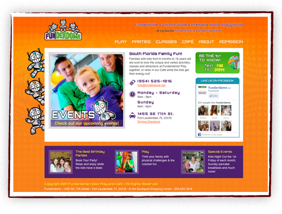



Funderdome in Ft. Lauderdale needed a new design for a WordPress website. We wanted something fun, modern, clean and easy to navigate. I designed the look of the website and Massive Impressions developed the website.
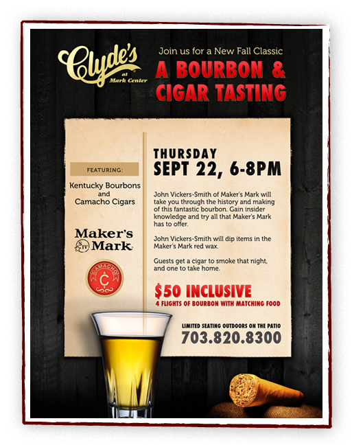
Clyde’s at Mark Center are hosting a new Bourbon and Cigar Tasting event and needed a poster and table tent card to advertise with.
A new company, and we’re starting with the logo. The company sells eco-friendly bamboo for your house and we wanted the logo to explain that visually. More marketing pieces to come…
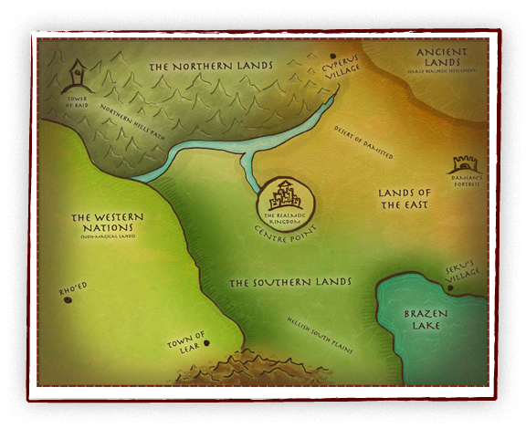
My first stab at a fantasy map for The Realmsic Conquest website. The client provided a sketch and some sample maps and I designed this in Photoshop. I had fun using my Wacom tablet to put this together.
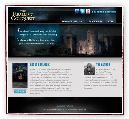
A while back I had designed a book cover for A. Demethius Jackson and he came to us for a website to go with the book. I had fun designing a site to match the art I had done before. We added a little Flash for effect and kept it clean, modern, and mysterious. The site is WordPress so it is easy to maintain and update.
You can view it live here.
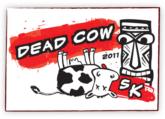
A fun request! A local luau-themed party needed a t-shirt for their 5k run. The dead cow aspect is a long and twisted story but makes for a great t-shirt!
Check out the awesome custom Django gallery Dejan and Vasil created. The gallery allows the user to upload a story and image and each visit to the gallery, or refresh, changes the content.
Visit it live!
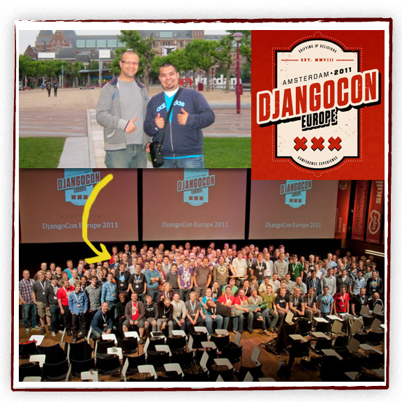
Vasil and Dejan, our amazing developers went to DjangoCon Europe 2011 in Amsterdam in June. A full week of Django talking and learning.
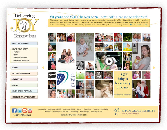
Here is the final logo design for a local organization. It is aimed for an older audience and the clarity of the type was very important to the client. The type all had to be fairly large and easy to read. Also we went with conservative colors to appeal to the target audience.
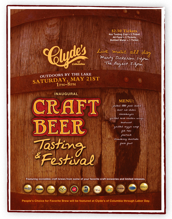
Clyde’s had a new beer festival coming up and I had creative freedom to come up with a design. Since the festival is featuring smaller breweries, I wanted it to feel handmade. I decided to draw the Craft Beer type instead of using a regular font to give it that handmade feel. I took a photo of a local rain barrel and used that for the background to give it an earthy feel. I incorporated the featured breweries on bottle caps. This is a large 20″ x 30″ poster. We made a few smaller pieces to complement the poster.