I designed an 11 x 17 Newsletter to go to residents in Marbury Plaza in DC. This piece was for UIP Property Management, Inc. It’s always hard to showcase folded pieces nicely but it folds twice and has a mailing panel.
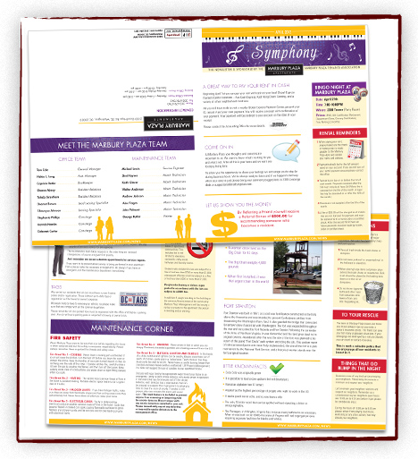



I designed an 11 x 17 Newsletter to go to residents in Marbury Plaza in DC. This piece was for UIP Property Management, Inc. It’s always hard to showcase folded pieces nicely but it folds twice and has a mailing panel.
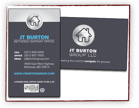
I designed double-sided business cards for JT Burton Group, a real estate company in Bethesda. I also designed a letterhead and email signature with a similar design.
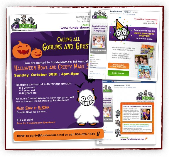
Along with launching a new website, Funderdome wanted a fun Halloween invitation. I turned one of their robots into a ghost! Also, designed two Facebook pages, keeping the branding we developed for the website consistent throughout.
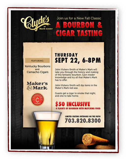
Clyde’s at Mark Center are hosting a new Bourbon and Cigar Tasting event and needed a poster and table tent card to advertise with.
A new company, and we’re starting with the logo. The company sells eco-friendly bamboo for your house and we wanted the logo to explain that visually. More marketing pieces to come…
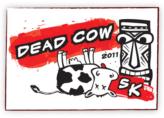
A fun request! A local luau-themed party needed a t-shirt for their 5k run. The dead cow aspect is a long and twisted story but makes for a great t-shirt!
Here is the final logo design for a local organization. It is aimed for an older audience and the clarity of the type was very important to the client. The type all had to be fairly large and easy to read. Also we went with conservative colors to appeal to the target audience.
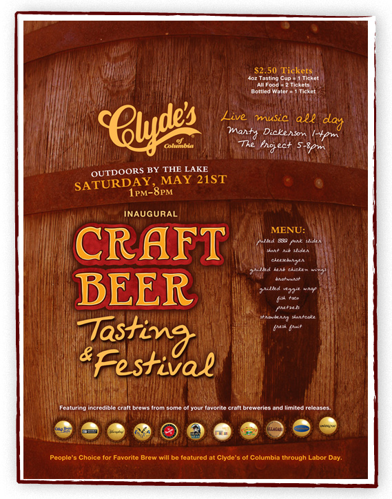
Clyde’s had a new beer festival coming up and I had creative freedom to come up with a design. Since the festival is featuring smaller breweries, I wanted it to feel handmade. I decided to draw the Craft Beer type instead of using a regular font to give it that handmade feel. I took a photo of a local rain barrel and used that for the background to give it an earthy feel. I incorporated the featured breweries on bottle caps. This is a large 20″ x 30″ poster. We made a few smaller pieces to complement the poster.
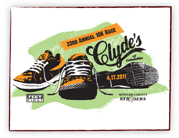
Another fun project. Clyde’s of Columbia has an annual 10K Race and needed a shirt design. I thought it would be fun to have a small collection of running shoes with a bit of old school feel. The final shirt was a nice white athletic running shirt.
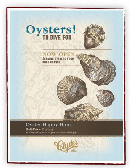
Here is a poster I designed for Clyde’s of Tysons Corner. They started serving oysters and wanted artwork to highlight their newest addition. Oyster lined artwork was given to me by Clydes, I simply colored the shells. I wanted the design to be classy, a little vintage, and fun.