A new company, and we’re starting with the logo. The company sells eco-friendly bamboo for your house and we wanted the logo to explain that visually. More marketing pieces to come…



A new company, and we’re starting with the logo. The company sells eco-friendly bamboo for your house and we wanted the logo to explain that visually. More marketing pieces to come…
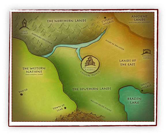
My first stab at a fantasy map for The Realmsic Conquest website. The client provided a sketch and some sample maps and I designed this in Photoshop. I had fun using my Wacom tablet to put this together.
A fun request! A local luau-themed party needed a t-shirt for their 5k run. The dead cow aspect is a long and twisted story but makes for a great t-shirt!
Here is the final logo design for a local organization. It is aimed for an older audience and the clarity of the type was very important to the client. The type all had to be fairly large and easy to read. Also we went with conservative colors to appeal to the target audience.
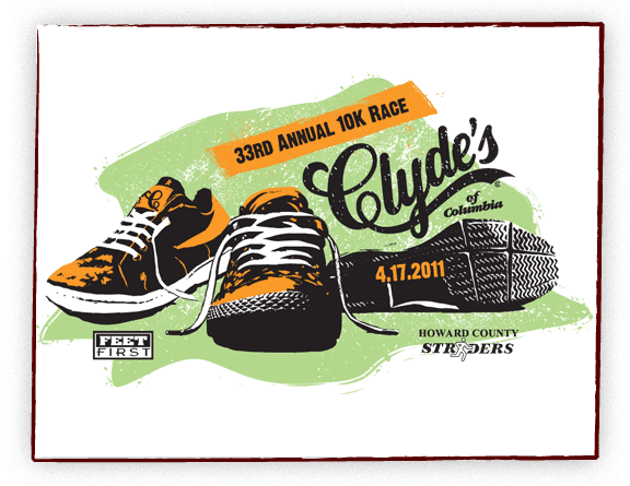
Another fun project. Clyde’s of Columbia has an annual 10K Race and needed a shirt design. I thought it would be fun to have a small collection of running shoes with a bit of old school feel. The final shirt was a nice white athletic running shirt.
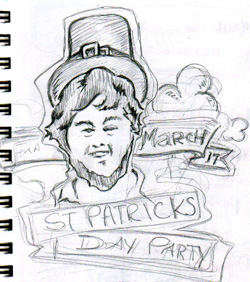
Clyde’s of Reston was having their first St. Patrick’s Day Party. They wanted leprechauns running through the Reston Town Center. All participants received a Tshirt. I had creative freedom to come up with something fun, a rare opportunity! I designed a rough sketch with a more generic leprechaun and just jumped into Illustrator from there.
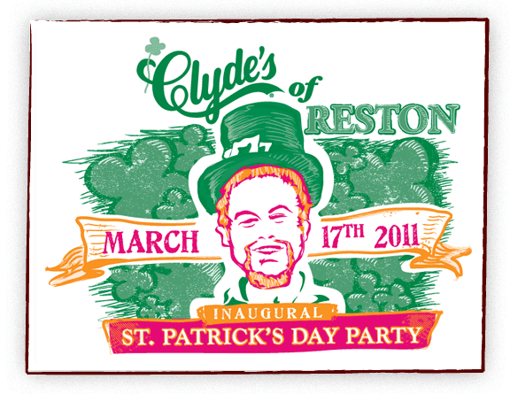
After an initial draft, Clyde’s asked if I could make the leprechaun look a little like the Manager at Reston. So we made tweaks and here is the final shirt!
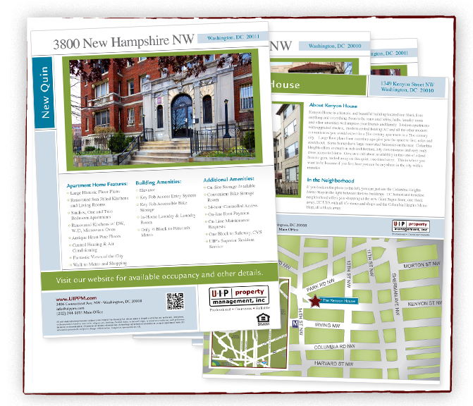
Urban Investment Partners is a realty group that needed a new design for their real estate flyers. In addition to their fresh design, they wanted me to draw a custom map for each property. I did two, one zoomed in for easier driving and one zoomed out to see the general location.
Check out their site!
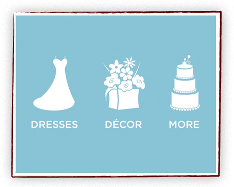
BRIDEfinds.com is coming soon. As they are building their website, they needed some identity icons to match they style of their sister sites – SHEfinds.com and MOMfinds.com. The challenge of icons is that they need to be able to read well in a smaller size. We came up with these three vector illustrations.
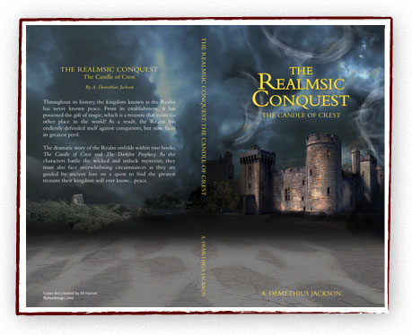
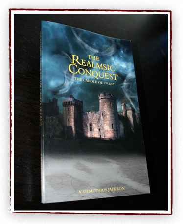
A. Demethius Jackson needed a cover for his first book. He had an idea of a castle being illuminated in darkness with three swirls of magic in the sky. Also in the one window is a faint candle flame. I created this book cover in Photoshop, using a collage of photos, brushes, and some harsh lights/contrast. This was a fun project, I’d love to design more book jackets.
The book is being sold on Amazon and Barnes and Noble.
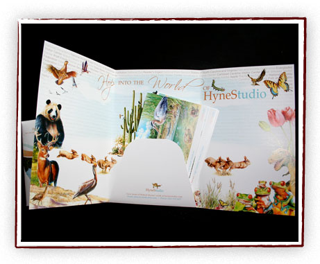
Super talented illustrator Bob Hynes needed a direct mail piece to showcase his work. We decided on a tri-fold brochure/folder format, to be mailed in a matching envelope. On the center inside panel, we made a piece to look similar to a business card that holds in a collection of take-out postcards. The postcards could be swapped in and out to be customized to the recipient. We used the outer panels to show off some of his favorite pieces and built a collage on the inside. I wanted to create a vision of his “world” when you open it up. I thought this piece came out playful and fun but yet professional.
You can see some of Bob’s amazing illustrations here.